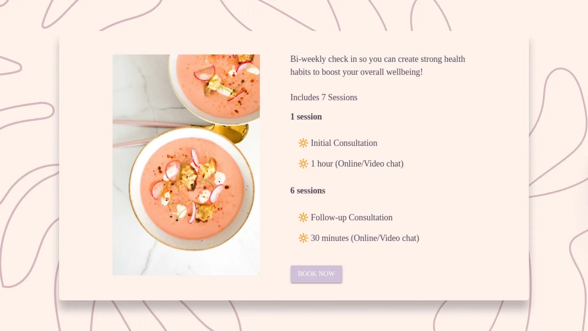
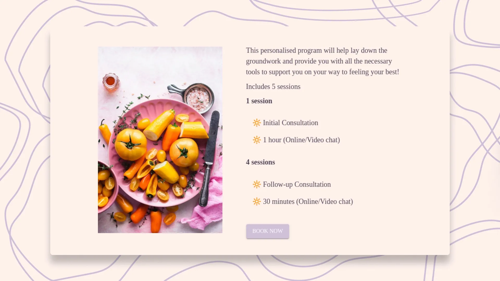
An identity built to feel welcoming, from the first impression to the finer details.
The Mood Nutritional Therapy provides nutritional plans and guidance. We created its branding, illustrations and website, giving the practice a visual identity and a place for people to explore its services and get in touch.
Developing the identity and website together allowed colour, imagery and layout to inform one another. The result brings an expressive visual character to practical information about the business and its offering.
A visual language of its own
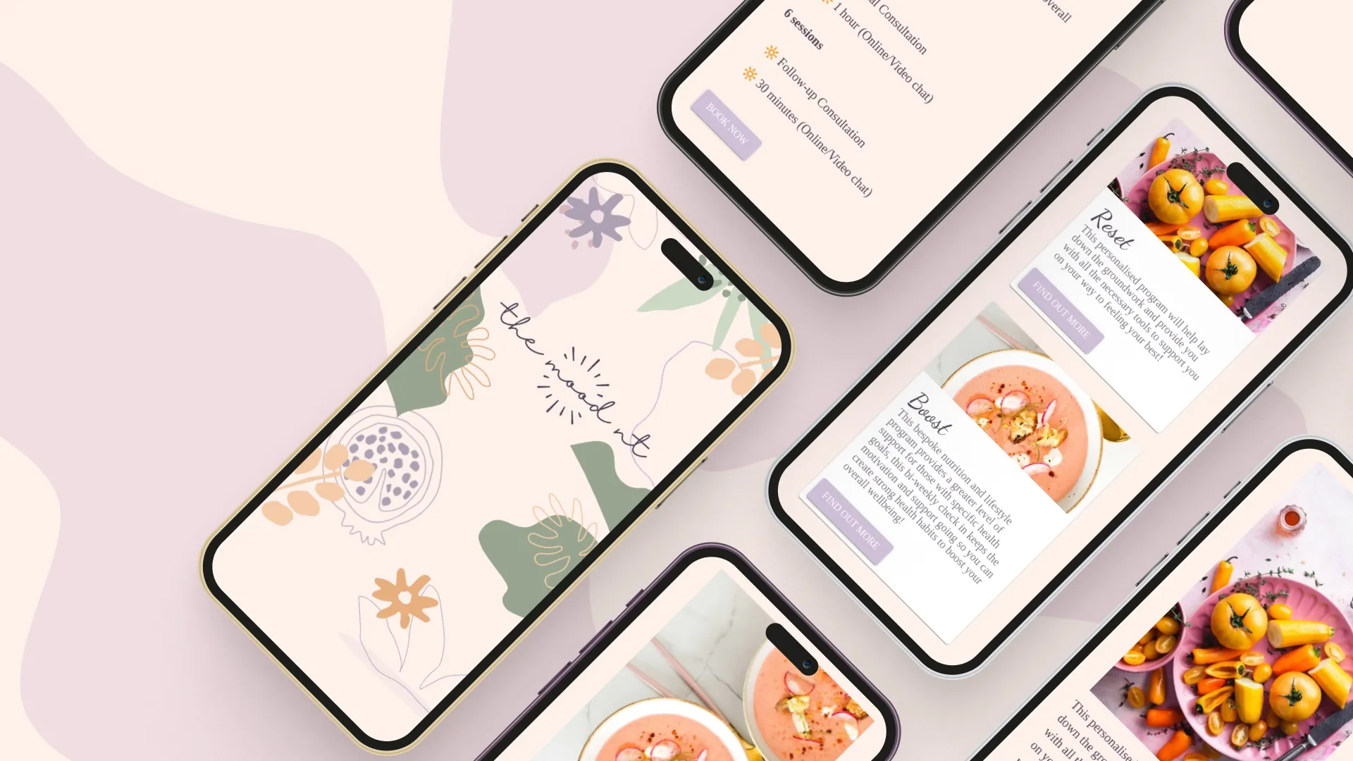
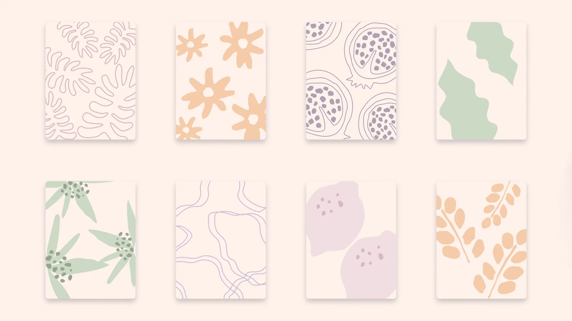
A soft palette of pink, purple, orange and green gives the identity variety while keeping a consistent mood.
Original illustrations and organic patterns introduce texture and character across the site. Alongside the typography, these elements form a recognisable visual language that can extend beyond a single page or composition.
Bringing the identity online
The website needed to introduce the practice, explain its services and make it easy to take the next step.
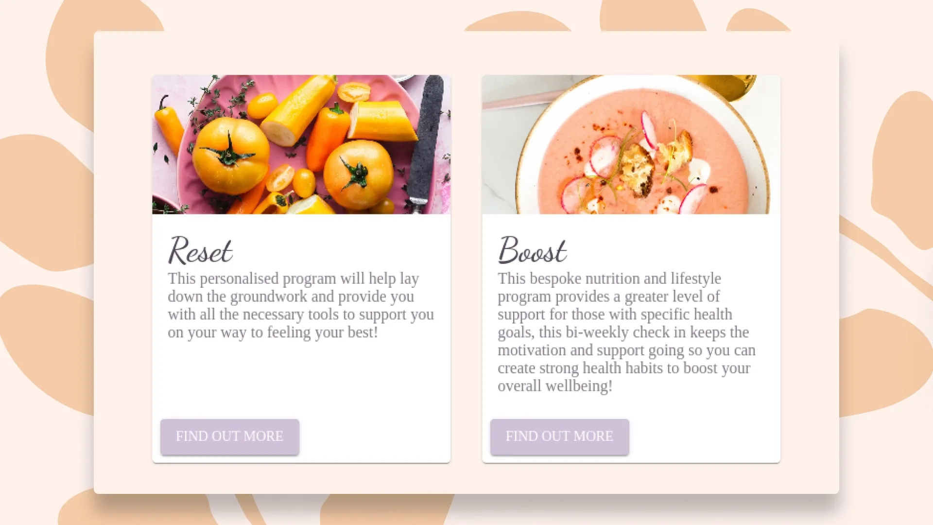
Illustration and pattern provide the setting, while service cards and clear sections organise the content. Stock food photography brings another texture to the pages, paired with the colours and shapes of the identity.
The balance matters: the visual elements create a welcoming first impression, while the structure helps visitors understand what is available.
Across different screens
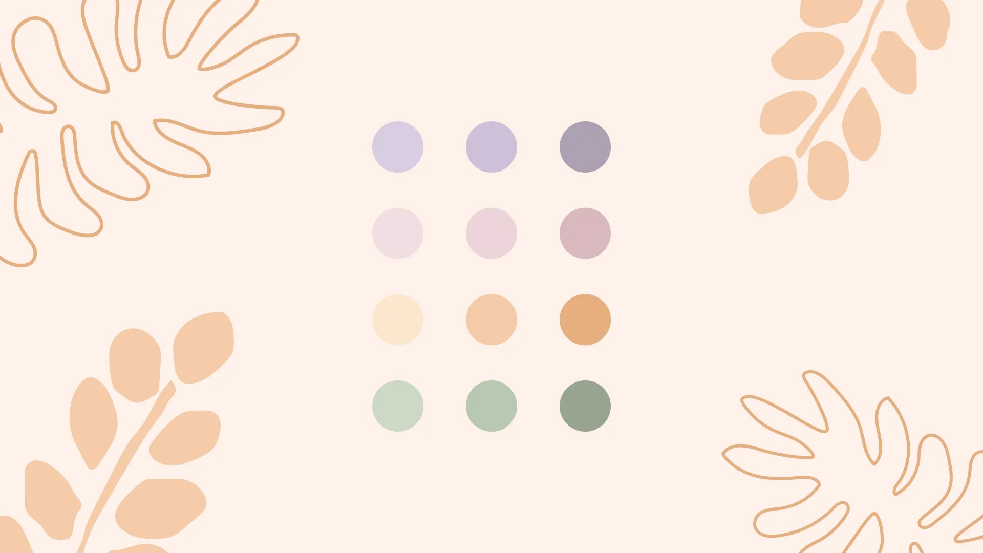
The identity carries through to mobile, with the same colours, illustration and photography adapted to a narrower layout.
Keeping those elements consistent helps the website feel like one experience across different screens, from the illustrated introduction to the service information and contact details.